Throughout my A2 course I have used so many new media technologies. When I started the course, I thought I knew everything there was to know about computers, blogger, photoshop, cameras etc. Last year I was amazed at how creative I could be with photoshop and indesign. Developing my photography skills, looking for hours to find the perfect name, font, colour and style for my music magazine. And I loved it... I couldn't believe the things I could do with these programs. After a year of discovering new things on a mac, I thought I had discovered everything it had to offer. More importantly, I thought that after a year of working with them, I had cracked them.
But oh how wrong I was...
I was in for a shock. It turns out that final cut express couldn't be more different to anything I've ever used before. It seems my skills developed last year may give me a head start, but they certainly needed broadening, and fast! As I started to unveil final cut, it didn't take me long to realize that final cut gave us the freedom to do literally anything. This programme allowed us to be how creative and imaginative we wanted, giving us the freedom to make our ideas into reality. This was undoubtedly the most advanced software I have used so far. So when it came to editing our video, we didn't really know where to start. By using a trail and error process, we started to get the hang of it, and realised that we could do whatever we wanted to our video. Despite coming across problems along the way, like cross dissolves not working the way they should and what should be split screens not actually being split screens, we managed to edit our video in the way we hoped.
The wonderful world of blogging...
I have used blogger to present all my work for this course and I cannot think of another program that would be better, I have thoroughly enjoyed using it. I love the fact that blooger gives me the freedom to illustrate my ideas in a more creative, interesting way, plus it allows the viewer to have interaction through the journey of my A2 work. I think that my blog is much more creative this year than it was last year, and I have used a much wider range of technology (for example scroll boxes, drop down lists, videos and slideshows). This has made the work much more enjoyable to create and also much more interesting to look at. What would I have done without the internet? It has been my inspiration. I used the internet for most of my research, and so without it I don't think the creation of our music video would have been possible. To research existing music videos, I used youtube, and I used many other websites to find out about the codes and conventions of music videos that were of our specific genre. Once we had our video ideas, the interent allowed me to compare what we wanted our video to look like to exsisiting videos, to see if we had included the right conventions.
Final Cut was what we used to edit our video and add all of the effects. With so much to explore in final cut, this was definitely our chance to develop our media skills, in order to create a high quality, realistic and interesting music video.
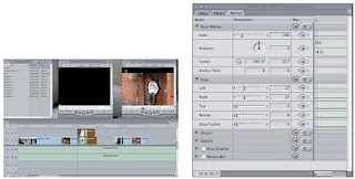
This video really helped us, although it did get quite confusing at times! Despite this, we managed to get an idea of the basics, and eventually managed to successfuly create a split screen.This video taught us how to do it, though it was actually much more basic than what the video makes out!
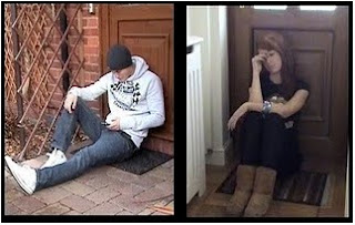
to create the split screen, we had to place the two images on top of each other, and then change the sizes of the shots so that they were equally next to each other, so that the split screen worked properly.


Photoshop was essential in creating our magazine advertisment and digipak. It allowed us to use different techniques, different layers and filters, different colours and different styles (for example text). We used the same basic template on photoshop for all three products, as this ensured we kept up the exact same house style, and created our product brand.


No comments:
Post a Comment